Back in June, Icelandic writer Hallgrímur Helgason was asked to give a speech at the outdoors opening of the architectural exhibition “New Nordic,” that can be seen until November 4 at the Louisiana Art Museum in Humlebæk, Denmark. Hallgrímur grabbed the opportunity to speak about modern architecture, a matter of long-time concern for him. “It was a bit difficult thing to do, to deliver this speech in front of 500 top Nordic architects, all beautifully suntanned and handsomely happy with a glass of white wine in hand. The reaction was everything from evil eyes to happy handshakes.” Grapevine got permission to print this speech. Here Hallgrímur speaks about the depressing surroundings of his childhood, the problem of “personal expression” in Icelandic architecture, the freak show of the Icelandic churches, “Lobbyism” as an architectural trend, the jealousy of architects towards artists and more…
Architecture is the skin of society. There is a tendency to forget it. And yes, there are body parts that you can say are more important, like the heart, the brain, the genitals… but still, you’re not worth much without skin. Plus, the skin is the biggest organ, and most of us like to have good skin.
1.
As a young man, I had a slight skin disease. My face was covered in pimples. This was also the case with my country. Iceland suffered from a skin disease called Terrible Architecture or, as it has also been called: Architectural Acne. We got used to living with it. Actually we got so used to it, that when I took my pimples to Norway, for my first summer abroad, I felt kind of uncomfortable, for over there all the houses were so nice and beautiful. Even deep in the woods, the remotest Norwegian bondegård had this great Scandinavian look, the one that makes you feel so good: A classic wooden house with a steep “straw” roof, the walls painted red and the windows in white.
Ah, man, and those windows… They all had the same shape, all made of wood, all divided into many squares, and all based on the golden ratio—“det gyldne snit”—all steeped in the golden tradition of the Nordic farmhouse. Every time you opened The Scandinavian Window, you felt like you were being painted by Munch. You stuck your head into a painting. You had been framed by beauty. Back home in Iceland you could only open a small part of a very modern and rectangular window, plus you always had to wrestle with the wind for to open it. Life in Iceland has taught us that opening a whole window of your house is a bit like opening your car door at 90 kilometres per hour.
Even our architects know this much.
But they are still struggling with the other stuff. Icelandic architecture was OK when the Danes were in charge. They built the downtown area of Reykjavík, in the nineteenth and early twentieth century, and all our nicest villages are stacked with the wonderful “Norwegian houses.” The first generations of Icelandic architects all learned their craft in Denmark, but after the World War II they went to study in Spain, The United States, Mexico and on the Moon. And this is where our problems started.
Our towns got infected with Architectural Acne.
2.
First there was the flat roof. It looked good in Guadalajara, but in super-rainy Reykjavík it gave every new house a free swimming pool—on the roof. My childhood is filled with memories of my parents and their friends struggling with the everlasting problem of leaks.
Then came the bunker-like suburban villa, spread out on one floor hidden by garden bushes. In the land of incredible views, our architects designed houses that looked like a garage with a glass door: From your living room you could only see your bushes and the behind of the next garage.
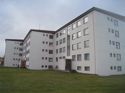
I grew up in a neighbourhood that was brand new back then. The concrete was still wet when we moved in. And somehow I never managed to have warm feelings for this shiny white apartment block of four floors. It was so cold looking. It looked like a fridge with windows. As if Iceland wasn’t cold enough. And the office buildings across the street, they all looked like stereo equipment. That was my childhood, stuck between Danfrost and Marantz.

3.
Another symptom was the raw unpainted concrete look, very popular in the seventies, as we didn’t have enough of that in Iceland. Our land is so to speak one big unpainted rock. (And actually we’re still dealing with things like that. In the past years we’ve for example been building many black buildings. Black buildings in the darkest corner of the world… It’s not really the best idea.)
Then we also had the problem of “personal expression” in architecture. This is a truly great thing when an architect’s name is, say, Alvar Aalto, but when he is called Guðbrandur Sigurfinsson, and he’s not really an architect, but a “teknolog,” you really don’t want his “expression” to be too personal.
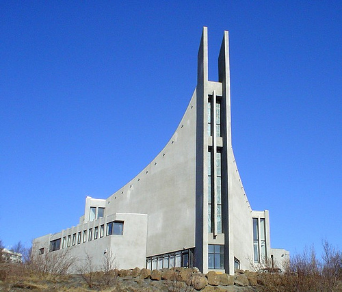
In our land, personal expression in architecture has mainly been reserved for the building of new churches. In the olden times we only had one type of church in Iceland. Now we have 167 types of churches and none of them look like a church at all. Instead we have “The Indian Tent,” “The Half Cut Bread,” “The Ski Jump,” “The Summer House With a Cross on the Roof and Stained Glass Windows,” and “The NASA Mobile Launch Platform That Accidentally Fell on the Ground After Liftoff of the Space Shuttle and Then Was Painted White.”
It’s like our architects decided to test God’s love for us. “Yes, let’s build him the ugliest house possible and see if he’ll still love us.”
So, if you’re into strange architecture you should go to Iceland and take a tour of the modern Icelandic church. It’s the most expensive freak show ever. All paid for by the state.
4.
But maybe the worst symptoms of our skin disease were the way we developed our only big city. In only fifty years it went from being a lovely little harbour town to becoming a concrete monster tied up by motorways. Copenhagen was based on Paris and still looks sort of like a Paris of red bricks, while Reykjavík looks like Rönne på Bornholm surrounded by Los Angeles. I’m not kidding. Reykjavík is the most spread out city on the planet. It’s one of the major achievements of modern city planning how they managed to make people who live in a city of 100,000 spend on average one hour per day in their cars.
This happened because for the latter part of the twentieth century we made it a rule: There had to be a space of 30 metres between houses and 30 meters from door to street, 30 parking spaces for each apartment, and every neighbourhood surrounded by a freeway. Reykjavík is like one big car festival. It has more gas stations than cafés. The happiest guys in Reykjavík are all Asian, with names like Toyota, Hyundai, Kia and Mitsubishi. And we were sort of happy about them, until suddenly now that half our salary goes into buying them drinks. So, today we dream of trading our car for a bike. But if Reykjavík is really to become a bike festival we need to speed up Global Warming, so we are all driving our cars like maniacs these days.

5.
And then we also have, like everyone else, suffered from “The Mall Invasion.” Malls are pretty much like turtles from outer space. They’re truly great for the ones inside but seen from the outside they’re just… giant space turtles. Actually, the “personal expression”-thing would be needed here. For the architects of malls are so busy with the interiors that they totally forget the outer look of those monsters. Maybe because here they’re designing for a blind God, called Mammon.
6.
Finally, we also had our share of the international craze in architecture called “lobbyism.”
Lobbyism became really big in the eighties and nineties, and you can still see it at work in many places. It came into being when people wanted to update the old public library, the old art museum or change the old fish factory into a local museum. The old building was OK, it only needed some renovation, but the entrance was really horrible. You needed a new entrance, a new lobby, furnished with a counter, a cloak room, a shop and a small café. I don’t know why, but our times seem to be all about entrances, making an entry, and first impressions. So you renovated the old fish factory and then added a new lobby to it, built of glass, steel and marble. You can spot it in every town: An old body of a building with a brand new glass cage at the front. In fact you can say that the rise of lobbyism in architecture went hand in hand with the rise of plastic surgery. Those renovated old buildings with fancy entrances often remind you of old ladies with silicone lips—a fancy entrance to a half-rotten body.
The National Gallery of Iceland is a classic case of lobbyism. Back in 1987 it moved into an old fish factory. The newspapers of the time complained a lot about the cost. The exhibition halls are quite plain but the lobby is a fiesta of white marble, glass and golden handrails, and came with the most luxurious elevator in the land. I think the explanation for this might be artistic envy. The architect envies the artist, this fucking bastard who never has to wake up in the morning but gets all the attention. So, when designing an art museum, the architect does all he can to steal the show from the artist: The examples are countless. If you have ever been to the Guggenheim in New York, the Guggenheim in Bilbao or “The Friendly Alien” Kunsthaus in Graz, you know what I mean. I have been to them all and from those trips I cannot remember a single artwork, only the buildings.
7.
Here at Louisiana you have quite the opposite, you can picture many exhibitions you’ve seen here, but not the building. Actually they don’t even have a postcard here showing the building, because there is no building. (No wonder you have such a hard time finding this place the first time you arrive at Humlebæk.) All you can picture in your mind are long corridors of glass and a brick wall. So it’s nice, except for that, as an Icelander, I have a small problem with brick walls. I just can’t stand them. Why? Because they are built with such care and patience, brick by brick. And they are meant to stand for a thousand years. It’s just so un-Icelandic, where we like to do things overnight and tear them down the day after. The Swiss artist Dieter Roth said of Reykjavík, where he lived for a while: “It looks like a temporary town. It looks like people only want to stay here for a couple of years.” He was spot on. Icelanders are always ready to leave. That is why we don’t like beautiful and complete towns, careful building and brick walls.
In fact, we have grown so attached to ugly buildings and bad architecture in Iceland, that we simply get sick when we are faced with perfect harmony. I always get homesick after walking through the picture perfect towns of the Swedish Skärgård, and in the Faroe Islands I felt like being trapped inside one big Bygdemuseum. In Tórshavn all the houses are built in the traditional style, no matter if they are from 1955 or 2005. Icelanders simply get depressed in surroundings like that. We don’t like it when things are too beautiful. We don’t feel like we deserve it. We just don’t feel right if we can’t spot a small part of an ugly sports arena or the back of a hardware mall that was built to last two years. So after a week in the beautiful Oslofjord we all end up looking like ‘The Scream’ by Edvard Munch.

8.
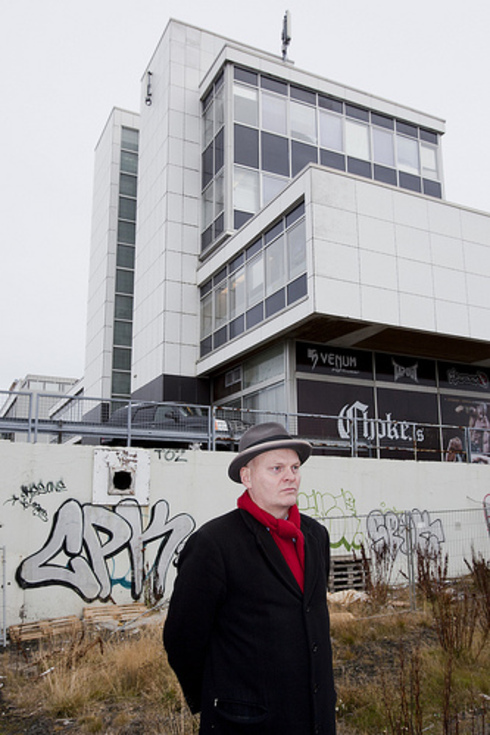
In the past years we have seen better times in our architecture. We grew up hating every new building that came along. That was when they looked like “stereo anlæg” with windows. But even though they’re still doing that sometimes (a few years ago they built a very grand hotel in Reykjavík that looks like my good old Bang & Olufsen amplifier turned upright) the past years have given us buildings that people actually like, like the brand new concert hall Harpa, the Reykjavík City Hall, or the Supreme Court building—all featured in the exhibition here. Today we have better architects. But this of course doesn’t solve our problems. The problem will always be the bad architects, and they will always outnumber the good ones. But at least we seem to have mastered the materials a bit. After playing with glass and steel for half a century we’ve managed to add a finer feeling to it, we now see more attention to detail. And though the roofs may still be flat, at least they’re not leaking anymore.
I think that for this we can thank the recent Scandinavian influence. In my youth there was nothing cool about Fjällräven, Fleksnes or Kim Larsen. Back then Nordic was nerdic. We didn’t want any influence from you guys. But then slowly Nordic became cool. And now we have Borgen and Noma, Larsson and Loreen. We’ve come a long way, over the hill and through the forest, into the city and now finally we have captured urban chic. The frequent flyer can easily tell you where he feels the slickest: It’s landing at Gardemoen airport, for it has the coolest architecture and the most modern facilities. We used to feel like the country bumpkins of the world but today we’re in a different position. Yet you still hear the old voices saying we’re only a couple of small nations good for nothing, that nobody cares about us. But these people are forgetting that today size matters in the opposite sense, in today’s world smaller is better. Four small nations and four micro ones are just the thing for a future full of iPods and nanotechnology. It’s easier to get reorganised when you’re small. In that sense Iceland will always move faster than China.
9.
A new kind of Nordic cool has been born. And now we only need to take it a bit further, out of the box. The roof doesn’t always have to be flat; it can be streamlined for example. Organic and curved lines seem to be the thing that’s coming. When time is travelling at the speed of 90 kilometres per hour this is exactly the thing we need. In the future all the houses will look like cars. And then you people can learn many things from us Icelanders. We really know how to build a city for cars, how to build throwaway houses, and how not to open the door at 90 km per hour.
Buy subscriptions, t-shirts and more from our shop right here!


