
Jonathan Barnbrook is a London-based veteran designer, creating numerous iconic typefaces such as Priori and Mason. Over his long career, he’s worked with everyone from the Occupy group to Sydney Biennale to David Bowie. We caught up with him just before his appearance at last week’s DesignTalks.

Your design seems to inhibit a world of its own, with a distinctive aesthetic that has evolved throughout the years, but carries an unbroken visual thread. Is this willful on your part? Are you aiming for a consistency?
I think the “mid-life crisis” is a real issue in design, as it is in pop music. The need for visual reinvention in design is similar to the need for constant reinvention in music. It’s pretty exhausting, but I get around it by always thinking of philosophy first. That drives the aesthetics, and I am rarely bored. We live in amazing, wonderful, depressing, changing times and it is very easy to respond to that.
I think though that the philosophies you are interested change as you get older. If your work when you are 40 is the same as when you are 20, then you are not being honest with yourself. It may seem to many that design being a commercial based activity. But all creativity, commercial or not, should have part of the soul of the person in it.
I also disliked intensely that many people couldn’t see the social possibilities of design to be a tool to fight back. Many people are using graphic design as a vital tool in protest because it is a very effective way of doing it. Instead this is politely ignored by many in favour of talking about the more commercial aspects of design, because it is easier.

Does anything come to mind that excited you visually, and you sought inspiration from, before beginning your career, that still resonates with you?
The musician John Foxx—his music, his artwork and his writing. He has been a constant influence on the themes I am interested in, and the visual language I use. The beauty he sees. The themes he is concerned with very closely match my own. I design his album covers, now, which I feel very lucky to do. Also, Hermann Hesse, the writer—his combination of spirit, beauty, and clear thinking was a big influence on me.
Your work, or the bits you highlight, seems to be high-profile art and culture design, and then a bunch of these insanely intricate designs for seemingly quite small businesses in Japan. How did that come about? Why do you think stuff looks so much better in Japan?
I am just interested in projects that are a new problem to solve. It doesn’t matter if they are big or small. There is a lot of interest in British design in Japan, maybe because UK designers always work in the areas of music and subcultures, which are extremely important there. My ex-partner was Japanese so it was a very good way to get introduced to the people and the culture there. I think often stuff looks better in Japan because of the visual novelty of a different culture and the fact you can’t read it—the letterforms become aesthetic shapes like the rest of the layout. Then also, Japan is a unique culture, extremely philosophical as well as superficial. I have gotten lots of new ideas from the people I have met and talked to there.
You’re coming to Iceland to talk, what’s the thesis?
My personal thesis is that I hope to know more about Iceland, and to experience the culture. It’s one of the few places I haven’t visited in my life, and I’m really interested—you further understand your own work, reasoning, routine, and way of being when you put yourself somewhere else. I want to know more about what makes it the place it is. This is something that’s not any one thing I‘ll see, but just the emotional feeling of a place, and the people.
My work thesis is that I hope to motivate a few Icelandic designers by saying that they don’t have to just take the corporate route to making a living. That it is possible. I am also sure that many people will be curious about what it was like working so closely with David Bowie, so I’ll talk about that too.
As a person who has sold typefaces for over two decades, I assume that you can see some ebbs and flows of fashion in visual language. I’m curious about that. Do you see distinct trends between parts of the world? What’s popular from your catalog now, and do you see any patterns from that? Any other insights from sitting on that end of the table?
I honestly don’t follow visual trends that much, but I‘ve noticed than when I first started in the late 1980s there was a love of vernacular and naive fonts. Vernacular, in that the fonts were made of people’s immediate visual environment, and naive in that young designers were suddenly allowed access to the previously “professional” area of design. There was then a move towards typefaces that would work for everything, that would have all of the weights and characters you’d need for multinational work. Now there seems to be a trend for a bit of naive simplicity in the drawings. I find that fonts have similar cycles to fashion—what’s happening is often a direct subversion of what went before, and that trend will come around again a few years later.
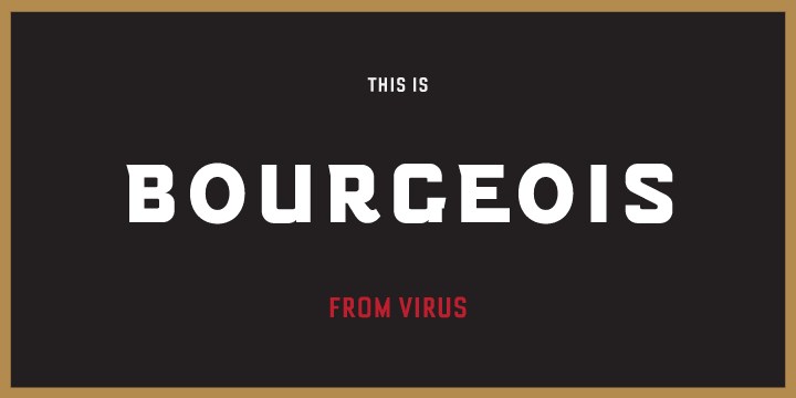
My most popular font by far is Bourgeois. It outsells everything else by a considerable margin. I never expected that, but I’m happy about it because it wasn’t an easy font to create. It was almost against my instincts at the time, but I wanted to do a fake modernist font, which has actually become a modernist font that people enjoy using for that purpose (if you see what I mean). We are currently extending the family, so there‘ll be more options for people.
Your type work is unquestionably on the “expressive” side of things. Do you see your typefaces viscerally, that is, do they carry a strong meaning, and do you ever feel that they’re being used “wrong”?
I see the whole of culture, civilisation and human history when I look at a piece of historical or contemporary lettering. I understand the parameters that made the lettering look like it does. How language was at the time, and how that can be used in relation to now.
When you work in new mediums, like video, do you dig into the technology or do you assume the director’s seat, or somewhere in between?
I live in a contradictory place, thinking I can do everything, so why not try? But also understanding that at some point, you’ll need to ask someone who’s more skilled in that area. I can use technology for the sake of it, and I have no problem about it affecting the look. The printing press is technology, and it affected how we perceive letterforms drastically. But I do think that the principles of good typography and design haven’t changed that much in the past 500 years.
If I remember correctly, around half the BA graphic design students in my type design course did something at least vaguely Barnbrookish, whether directly influenced or not. Do you ponder your legacy or influence?
Well, that is very nice to say but also… I don’t care! When I’m dead, I’ll have no need to have a legacy. I suppose, generally, I would like it if people respected design a little more, and me a little more now, but that might be something to do with the way design is perceived in wider society. Also, I think giving creative people too much respect can allow them to do bad work.

What was working with Bowie like? Any fun stories? What type of input did he have?
It was an honour, great fun, and of course good for my ego… after all, if Bowie asks you to work for him, then you must be good! He was a really nice guy and I loved his music, so it was a project I loved to do. Also, the thought of adding to music history whenever I did a cover for him. It was a really great experience. What amazed me was how respectful and funny he was. He always had time for me. I remember going to New York, saying if we needed to meet then we could. I said I was with my mother, and so when we turned up at the hotel there were flowers for her, and a present of cosmetics from Iman. He also invited me to his rehearsals, and asked what songs I would like him to play for me. He didn’t need to do all that, but he wanted to show his respect, and I think he was like that with most of the people in his life. I was talking to him just a few weeks before he died. I miss his presence in my life.
—
See More DesignMarch articles here.
Buy subscriptions, t-shirts and more from our shop right here!


